Single Hand Clock
Product & Packaging Design


A minimalist timepiece designed to offer a different approach to timekeeping.
Instead of multiple hands, the clock features a single pointer that marks both the hours and minutes, using large numerals for the hours and smaller markers at 5 and 15 minutes intervals to aid intuitive reading.


The design ethos of the clock extends across its supporting materials, reinforcing a unified visual language.
Echoing the clock’s minimalist nature, a restrained typographic system was adopted to balance clarity with simplicity. This approach is carried through to the packaging and accompanying brochure, where simple layouts, neutral tones, and product detailing create a cohesive narrative — from its presence on display shelves to the unboxing experience, and through to the daily use of the clock itself.


Komorebi Magazine
Editorial Design of an Art & Culture Magazine

Thirdway Boutique
Editorial Design for an Interior Design Company

Megazine
Identity & Editorial Design of an Art‑Feature Publication

Type & Riso
Poster Design for a Creative Workshop

Miamani Fortura
Identity & Editorial Design for an Independent Artist

Clutch
Branded Assets Design for a Restaurant & Bar in East London

Easy Cookbooks
Editorial Design of a Cookbook Series

The Eastern Edge
Editorial Design of a Publication about East London

Everyday Objects
Design & Production of an Exhibit of Ordinary Products

Single Hand Clock
Product & Packaging Design of a Minimalistic Timepiece

G20-16
Identity & Cover Design of a Student‑Lead Publication

EX.CO & IAB
Interactive Article promoting roles into Digital to students

Valerio
Identity Design for an Independent Gardener

Donati Metalli
Logo/Identity Design for an Italian Metallurgical Company

EX.CO & Boots
Interactive Digital Article promoting Boots Vitamins for Kids

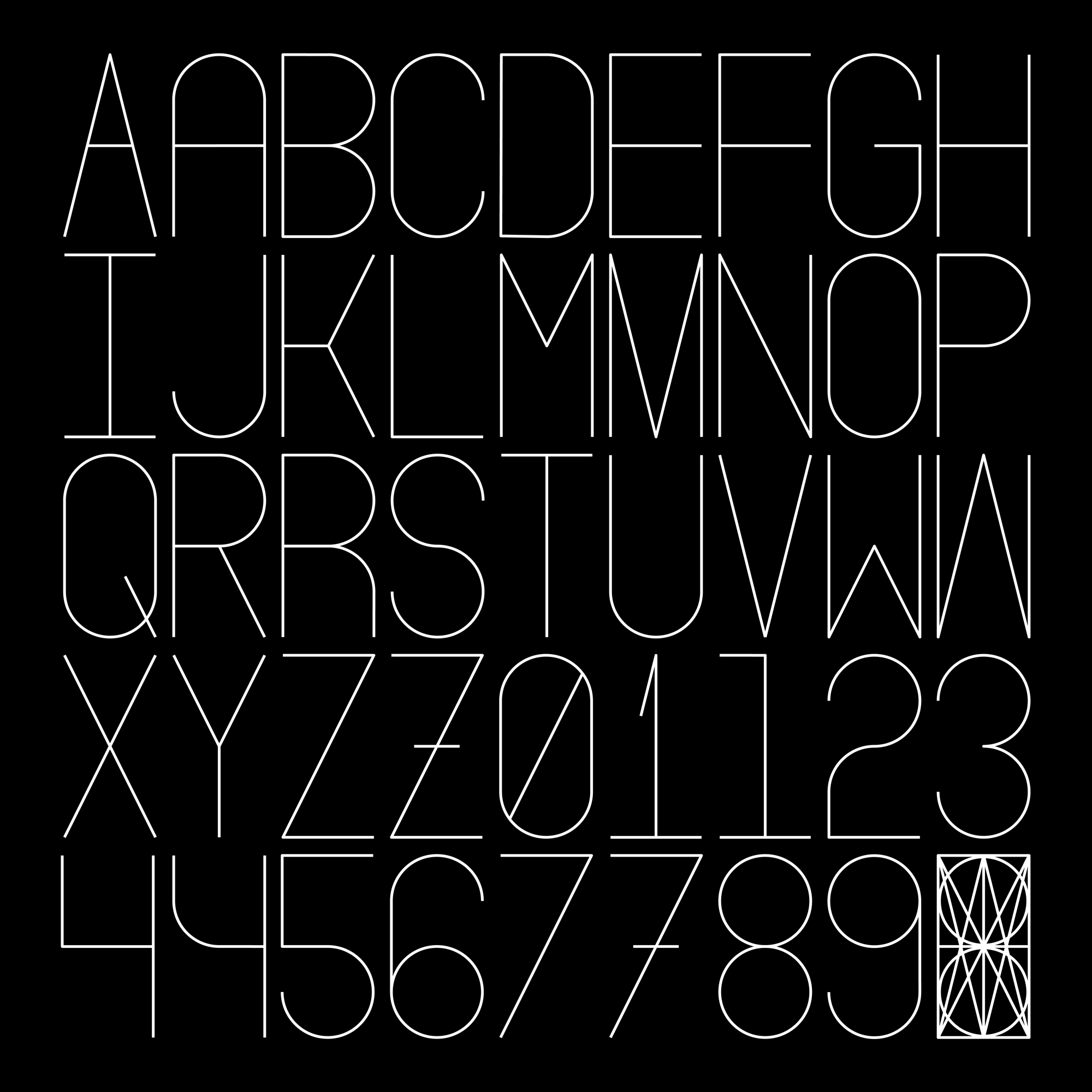
Undone Type
Alphabet Design
Houdini Alphabet
Alphabet Design