G20-16
Identity/Cover Design

G20-16 is a limited-edition, student-lead publication designed to be distributed to guests at the 2016 New Designers event, held at The Business Design Centre in Islington, London.
As a collectively produced, hand-bound booklet, showcasing the work of final-year Graphic Design students from the University of East London, G20-16 served as both a portfolio and a statement of their creative identity. The booklet embraced a bold, industrial aesthetic, with high-contrast colours and dynamic typography, reflecting the energy and diversity of the graduating class. Each student contributed with their own pages, resulting in a publication that was individually expressive — highlighting their unique approaches to design.


Approached by the university’s Art & Design course leader, I was tasked with developing the identity and cover design, as well as facilitating workshops to guide students through the publication’s design and production process.
With vibrant, high-contrast colours and a hand-assembled format — incorporating varied page sizes, materials, and layouts — the publication was designed to highlight the diverse, experimental, and tactile nature of the students’ work, making it a distinctive and memorable piece at the exhibition. Beyond creating its cover and identity, I also developed layout templates that provided students with production and binding guidelines while still allowing them the creative freedom to showcase their work as they saw fit. Additionally, I facilitated workshops, tutorials, and inspirational sessions, guiding students through the process of producing their own pages, ensuring each contribution reflected their unique voice within a unified and collaboratively crafted publication.


Komorebi Magazine
Editorial Design of an Art & Culture Magazine

Thirdway Boutique
Editorial Design for an Interior Design Company

Megazine
Identity & Editorial Design of an Art‑Feature Publication

Type & Riso
Poster Design for a Creative Workshop

Miamani Fortura
Identity & Editorial Design for an Independent Artist

Clutch
Branded Assets Design for a Restaurant & Bar in East London

Easy Cookbooks
Editorial Design of a Cookbook Series
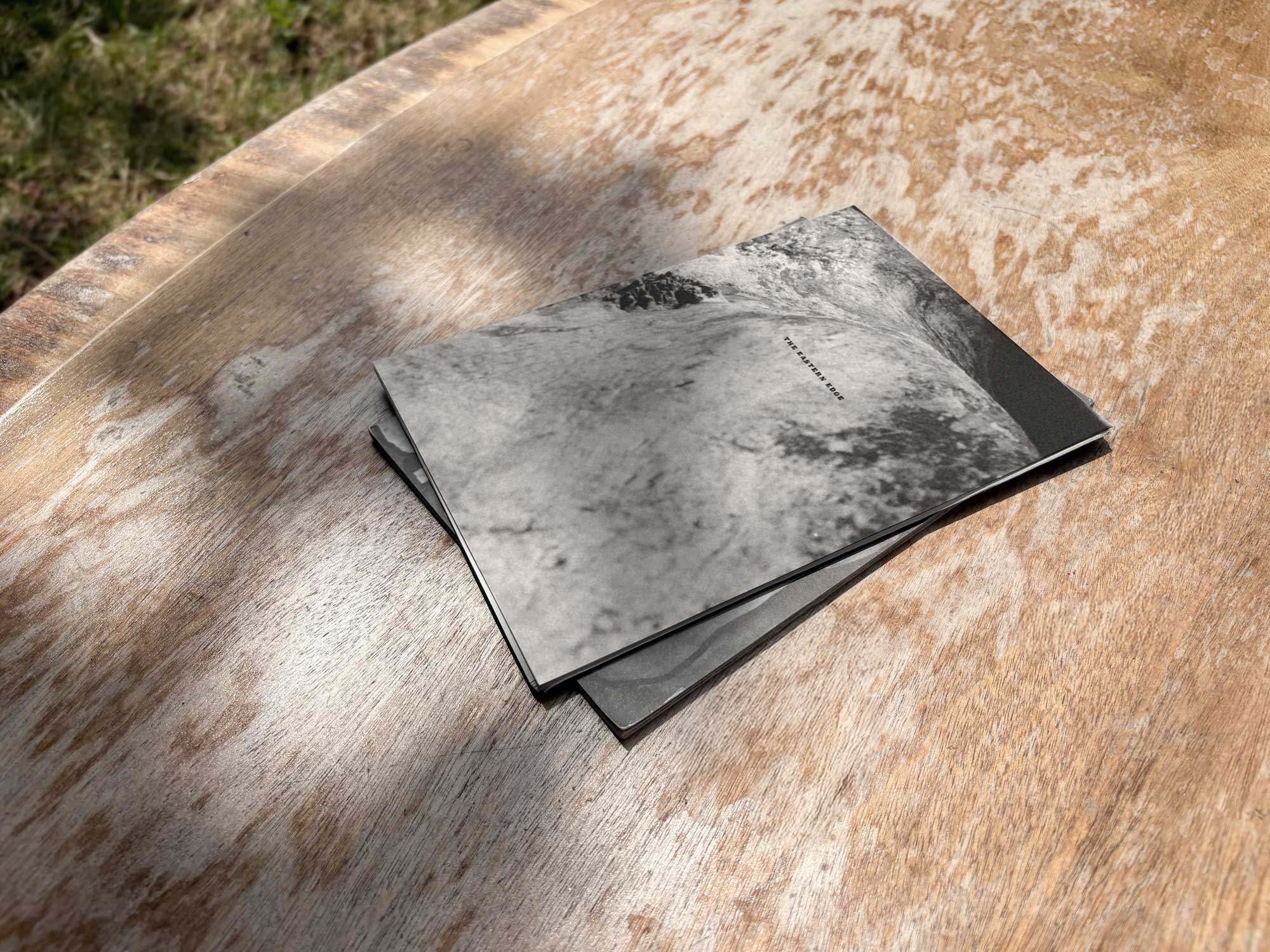
The Eastern Edge
Editorial Design of a Publication about East London

Everyday Objects
Exhibit Artwork Design & Production

Single Hand Clock
Product & Packaging Design of a Minimalistic Timepiece
G20-16
Identity & Cover Design of a Student‑Lead Publication
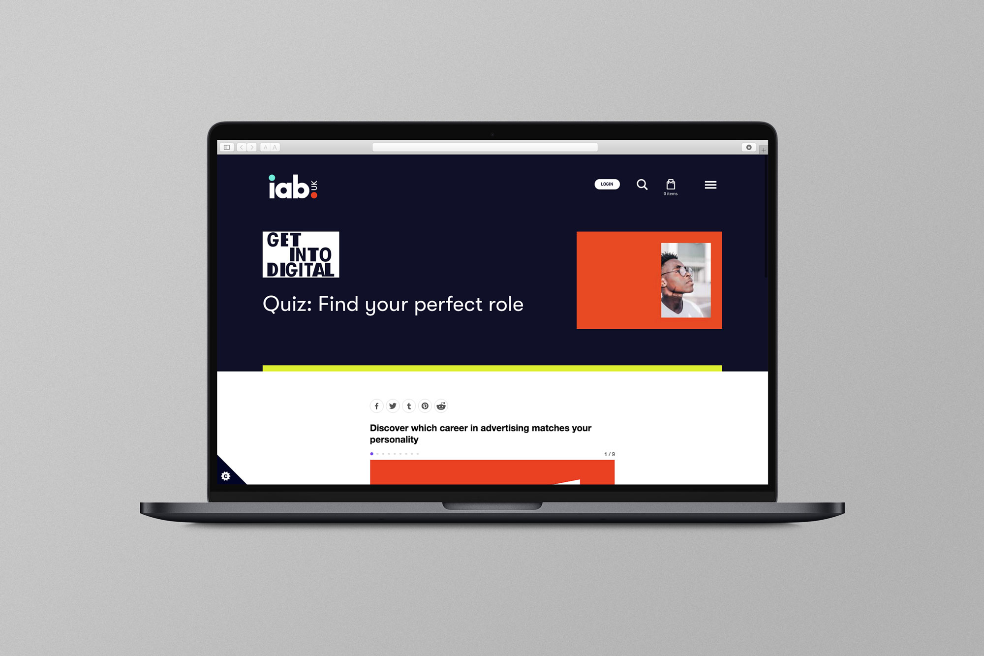
EX.CO & IAB
Interactive Article promoting roles into Digital to students

Valerio
Identity Design for an Independent Gardener

Donati Metalli
Logo/Identity Design for an Italian Metallurgical Company

EX.CO & Boots
Interactive Digital Article promoting Boots Vitamins for Kids

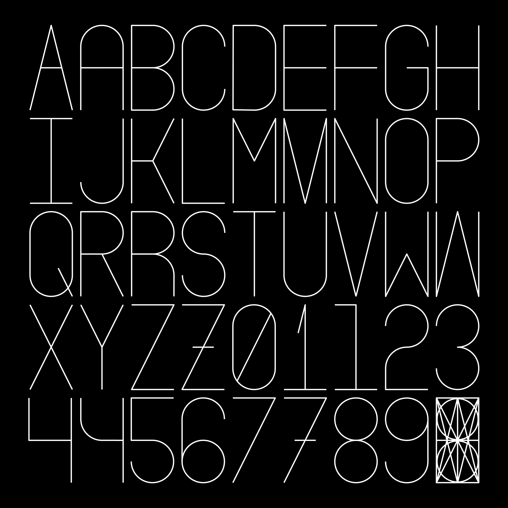
Undone Type
A Geometric Alphabet Design
Houdini Alphabet
An Alphabet Designed from a Grid-Like Figure