Easy Cookbooks
Editorial Design
A three-part cookbook series designed to support and enhance the cooking experience through a balance of clarity, tactility, and visual engagement.

Intro / The Brief
Distinguished by their culinary topics, Easy Cookbooks is a three-part editorial project developed in collaboration with a chef, aimed at making home cooking accessible, engaging, and enjoyable. Each book (Easy Sea, Easy Meat, and Easy Vegan) focuses on a specific theme while sharing a unified design language.
The goal was to develop an editorial system that would support clear recipe delivery and intuitive navigation, while offering a tactile presence that readers could connect with.


My Role
Working closely with the chef, I developed the editorial direction and design of the series — from cover design and layout to typographic approach and visual tone.
My role included the full development of the books’ visual identity across the volumes. This involved designing bold, visually dynamic covers, building flexible interior layouts, and selecting colour palettes and typographic systems that responded to each cookbook’s individual theme — while still aligning as a cohesive series.


Concept / Strategy
The design focuses on clarity, usability, and visual engagement — making the cookbooks not only tools but companions in the kitchen — reinforcing the connection between the tactile nature of cooking and the printed pages.
Creating a unified design system, introducing variety while maintaining a consistent visual theme throughout the volumes.
Approach
Visual Consistency: Each book adopts its own colour scheme and ingredient-focused imagery, with all three designed to tie together through type, structure, and layout — creating distinctive volumes while maintaining a recognisable series that reads as a single family.
Engaging Cover Design: Featuring imagery chosen to reflect each culinary theme, the covers combine bold, large-scale typography with carefully selected high-quality food photography, where imagery interacts directly with the text to create a tactile and engaging connection between the books and the cooking experience.
Structured Pages Layout: Recipes are structured within a clean, simple, modular grid system, with numbered steps and sections guiding the reader through the cooking process. Focusing on usability, engaging elements are implemented to echo the covers’ design concept — with layered images, compositions, and accented visual elements — designed to further reflect the hands-on nature of cooking, creating engagement within the page while maintaining instructional clarity.


With multiple recipes and culinary themes, the challenge was to balance consistency with variety — creating a steady page rhythm across the volumes that made the books feel like part of the same family, yet distinct in their own right.
Each cover features playful integration between photography and typography — a red pepper curling into the type on Easy Vegan, fresh clams sitting directly on the page of Easy Sea, and a fresh cut nestling snugly into the letterforms of Easy Meat. Endpapers introduce the content through hand-drawn illustrations of ingredients, using these elements not just for decoration, but to open the pages with a sense of craft and creativity. The inner layouts pair full-bleed food photography with structured sections and numbered steps, allowing visual and instructional content to work together in a seamless, intuitive rhythm.

As companions in the kitchen, each volume invites readers into a practical and engaging experience — with collections of recipes aiming to enhance the process of cooking without overwhelming it.
Bold covers, ingredient-driven imagery, and intuitive, structured layouts are designed to work together to make cooking experiences accessible to all levels — guiding home cooks through clear, visually engaging steps that support confidence, creativity, and ease in the kitchen.

Komorebi Magazine
Editorial Design of an Art & Culture Magazine

Thirdway Boutique
Editorial Design for an Interior Design Company

Megazine
Identity & Editorial Design of an Art‑Feature Publication

Type & Riso
Poster Design for a Creative Workshop

Miamani Fortura
Identity & Editorial Design for an Independent Artist

Clutch
Branded Assets Design for a Restaurant & Bar in East London
Easy Cookbooks
Editorial Design of a Cookbook Series
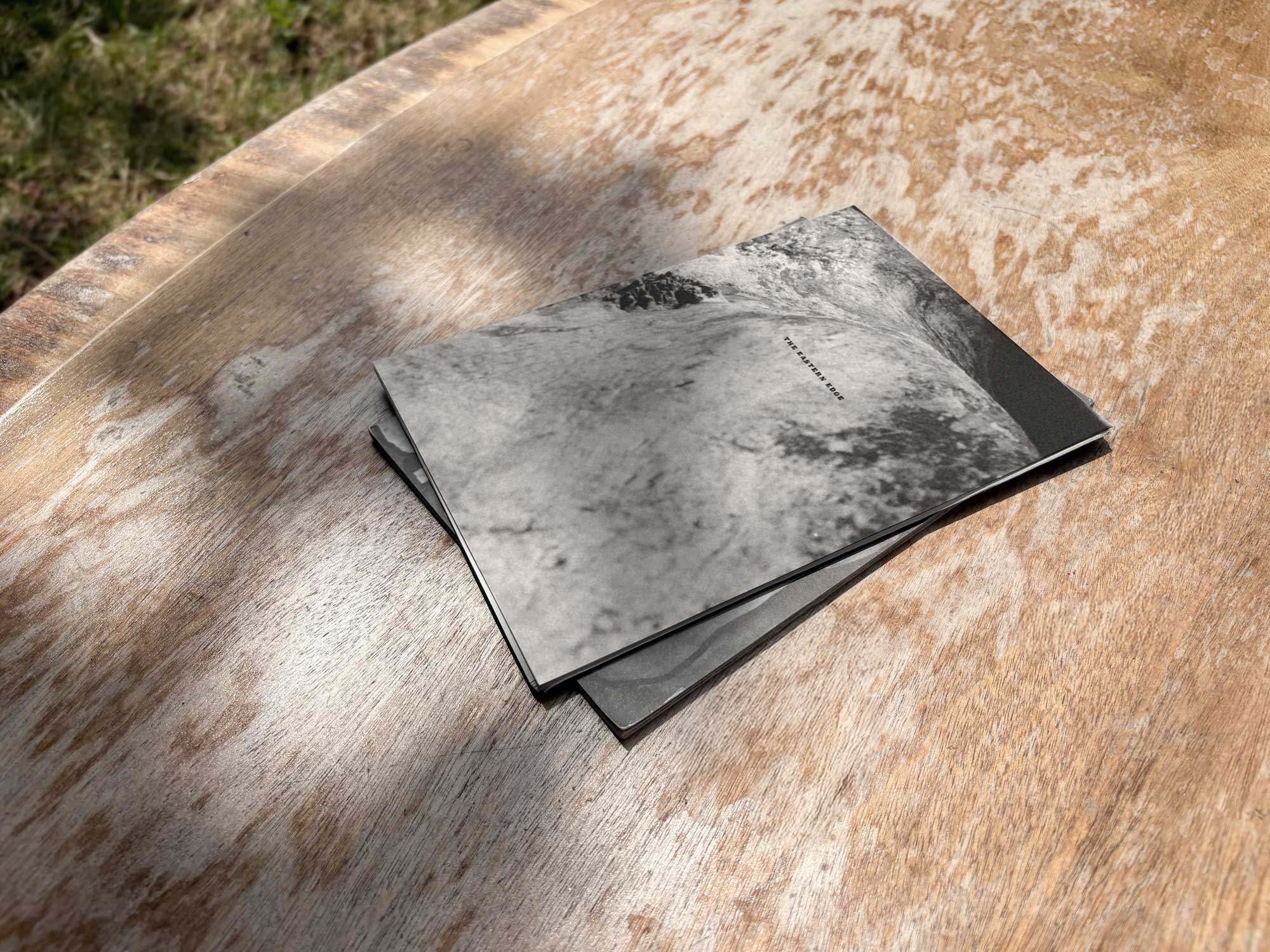
The Eastern Edge
Editorial Design of a Publication about East London

Everyday Objects
Design & Production of an Exhibit of Ordinary Products

Single Hand Clock
Product & Packaging Design of a Minimalistic Timepiece

G20-16
Identity & Cover Design of a Student‑Lead Publication
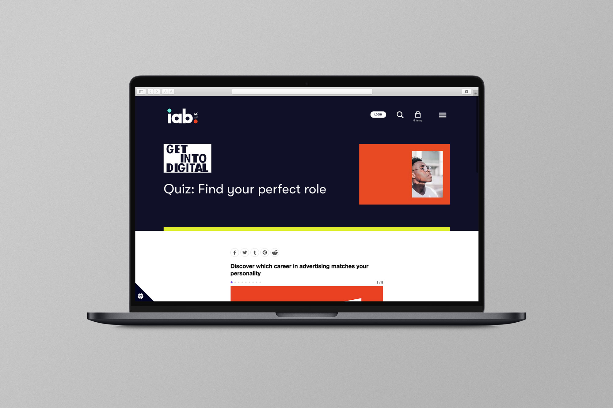
EX.CO & IAB
Interactive Article promoting roles into Digital to students

Valerio
Identity Design for an Independent Gardener

Donati Metalli
Logo/Identity Design for an Italian Metallurgical Company

EX.CO & Boots
Interactive Digital Article promoting Boots Vitamins for Kids

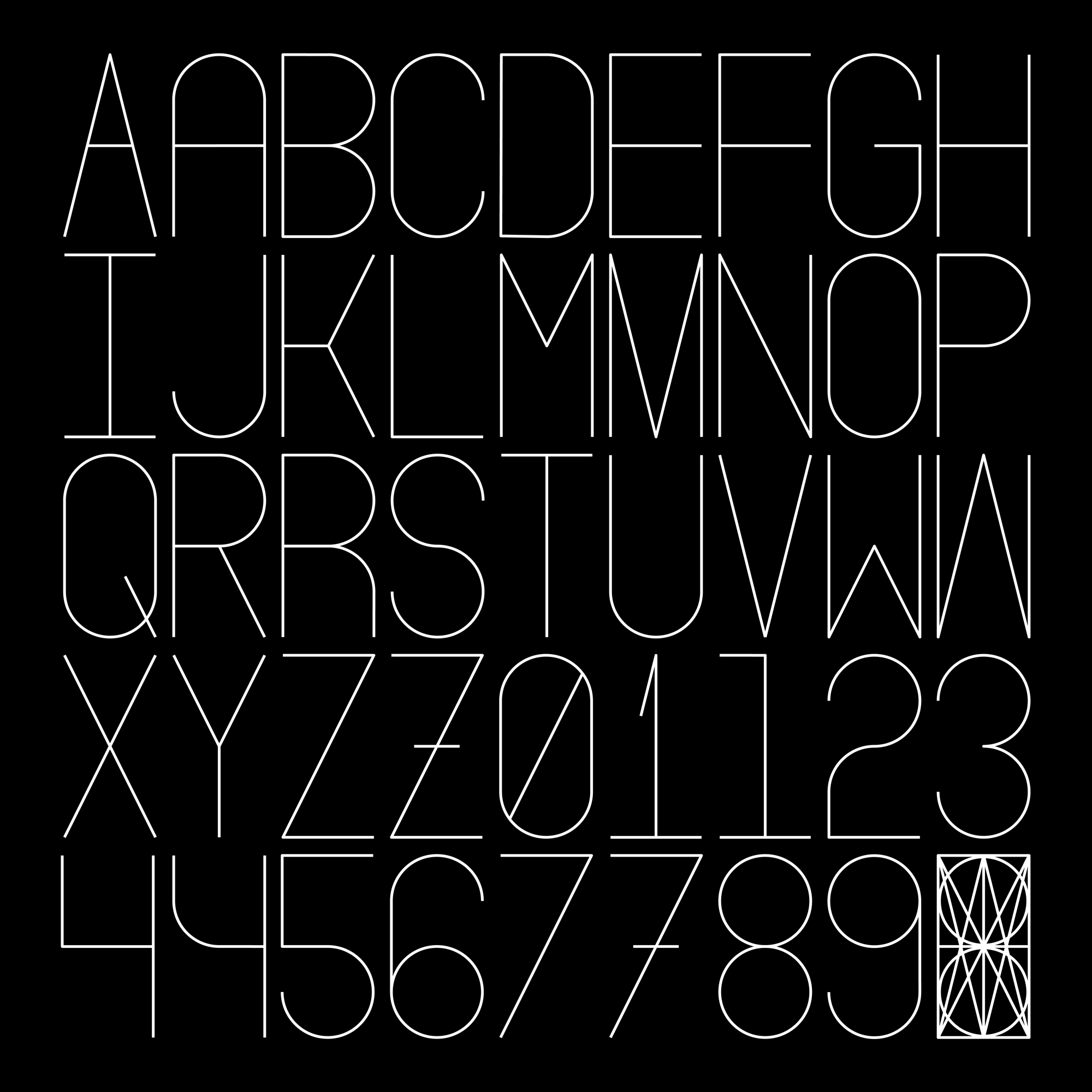
Undone Type
Alphabet Design
Houdini Alphabet
Alphabet Design